





가나출판사 아이덴티티 디자인 리뉴얼
GANA Identity Design Renewal
2020
디자인. 김어진
Design. Kim Eojin
가나출판사 GANA
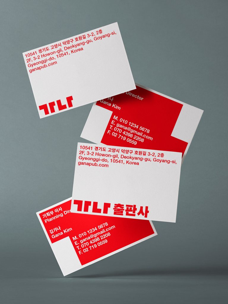
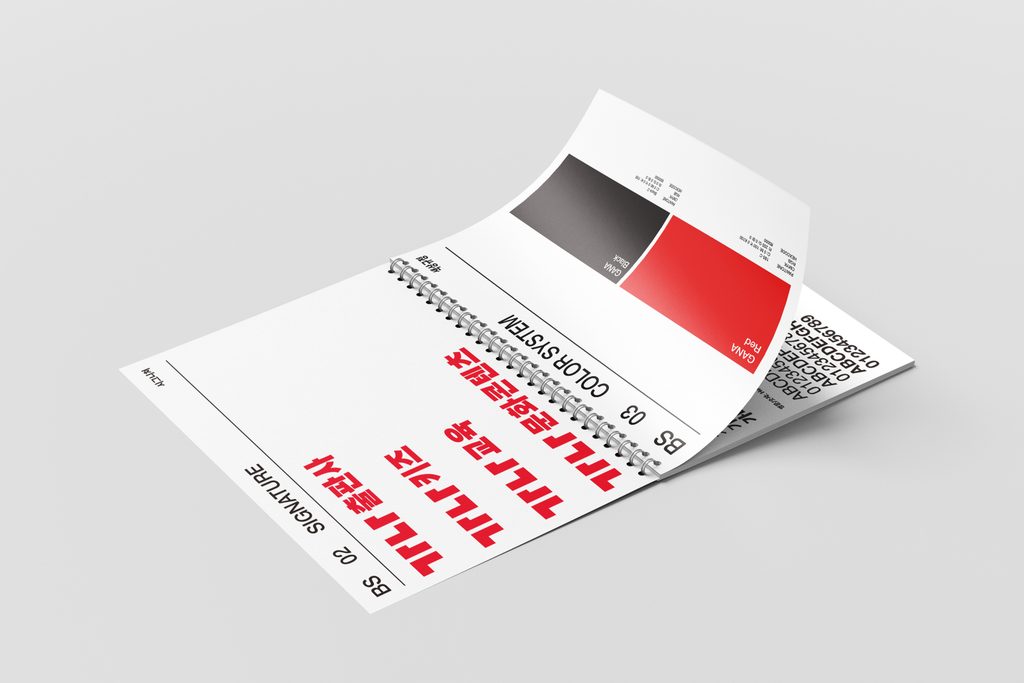
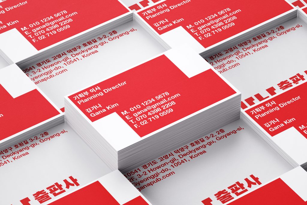
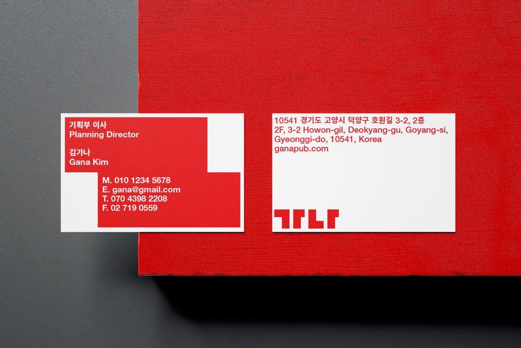
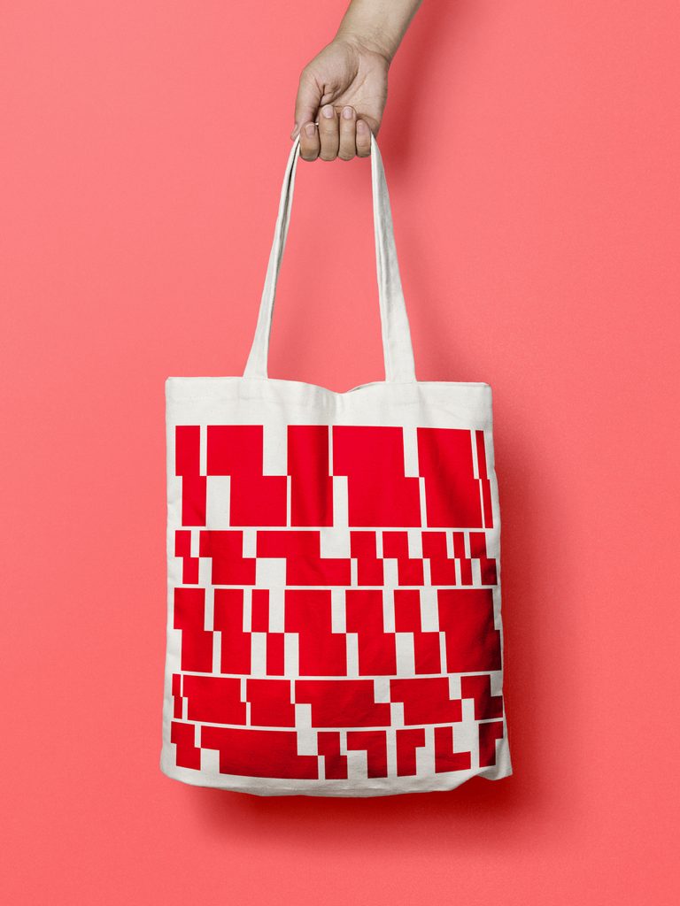
출판 및 문화콘텐츠 기업 〈가나〉의 C.I 리뉴얼 디자인 프로젝트이다. '삶의 기본 가치와 지식의 즐거움 전달'이라는 비전 아래 교육, 아동 등 다양한 분야에서 활동하는 기업이다. 리뉴얼 컨셉은 한글 자음 'ㄱ', 'ㄴ'과 모음 'ㅏ'의 형태를 정사각형 모듈 안에서 재구성하고, 두 자음을 연결해 '가나를 통한 새로운 가치의 틀(Frame)'을 그래픽 모티프로 개발했다. 대칭으로 이루어진 그래픽 모티프는 내용을 담는 영역으로 글의 분량에 맞춰 변형과 확장이 가능하다.
This is a CI renewal project for , a publishing and cultural content company. Driven by the vision of "delivering foundational life values and the joy of knowledge," the enterprise operates across diverse fields including education and children's content.
The renewal concept deconstructs and reassembles the forms of the Korean Hangul consonants 'ㄱ', 'ㄴ', and the vowel 'ㅏ' within a square modular grid. By connecting the two consonants, the design introduces a graphic motif titled "A Frame of New Value Through GANA." This symmetrical graphic frame acts as a dynamic content container, flexibly adapting, scaling, and transforming according to the volume and layout of the text.