
디자인. 김어진
Design. Kim Eojin
메모리플랜트 Memoryplant
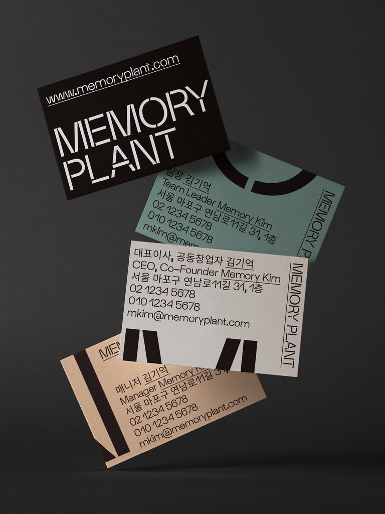
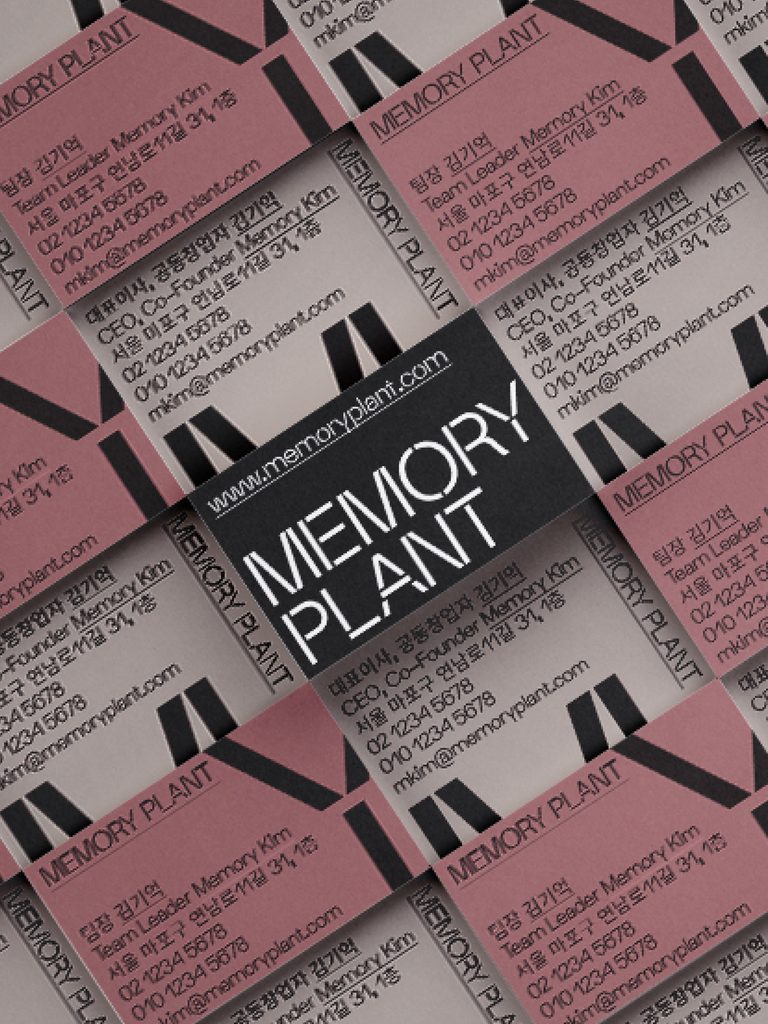
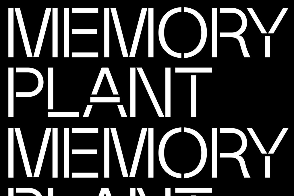
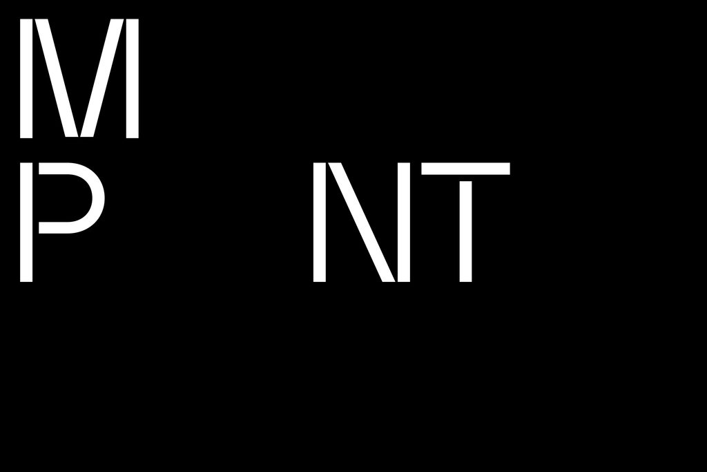
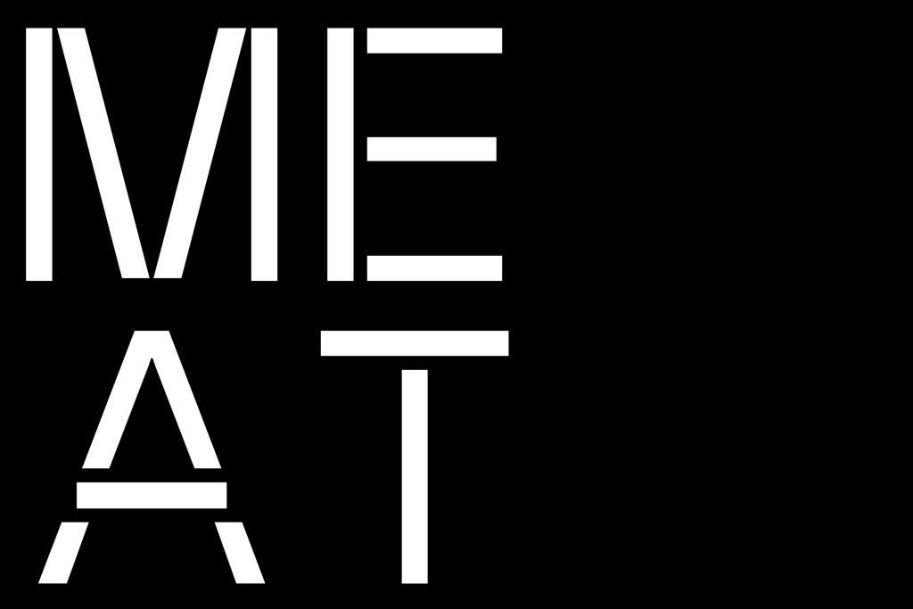
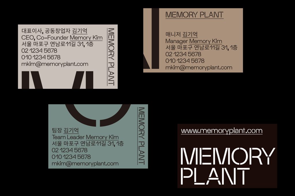
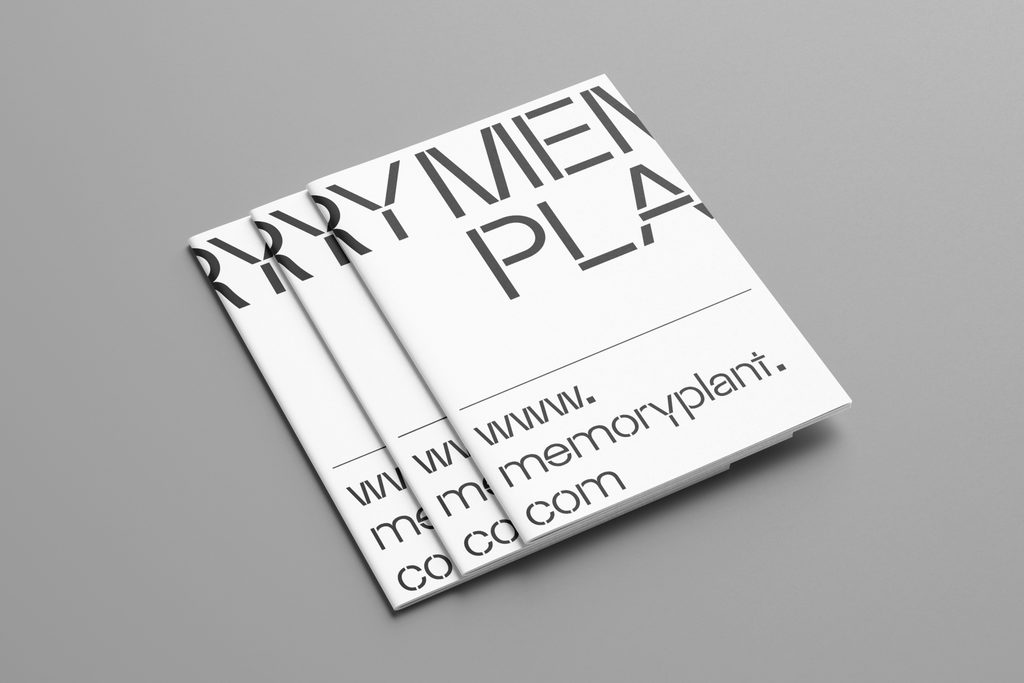
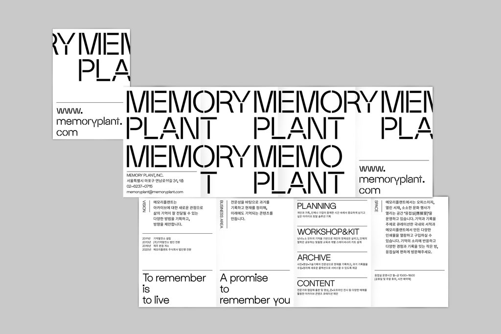
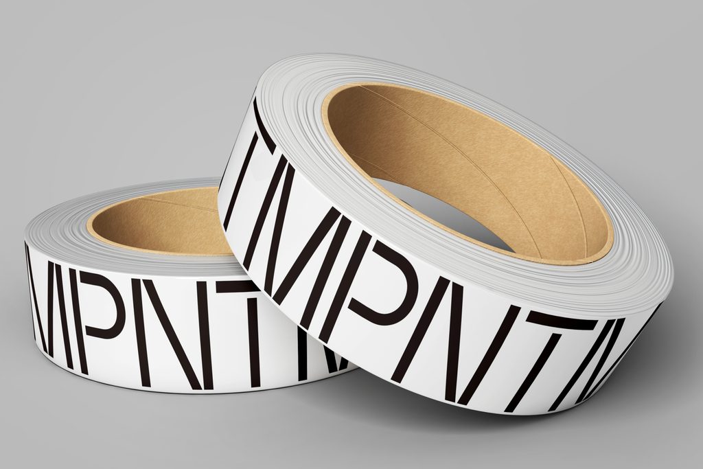
This is a CI and branding design project for Memory Plant. Formerly known as Memory Power Plant , Memory Plant is a creative company that goes beyond mere archiving, expanding into publishing, lectures, and other diverse fields to explore the core values of life. The design direction was established under the concept of "Archiving Memories, Shelves of Records." The visual identity combines motifs of bookshelves and shelving units with the wordmark to establish a structured, thoughtful impression. The wordmark is constructed based on the SM Maxéville Constructed typeface, while the custom SM Maxéville Regular font is systematically applied across various brand application touchpoints.